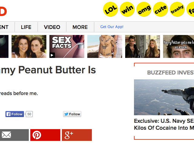
There’s no #8. Come on, you’re better than that.
But why are headlines like these such an easy trap to fall for, and why does it keep getting set? It’s about more than just the page views…
#36: We’re Obsessed With Lists
We’re all suckers for it: You get to the end of an article on the Huffington Post and decide that yes, it is worth your time to scroll through the 40-picture photo gallery that’s sort of related to the story you were reading. Or maybe your friend posts some Buzzfeed quiz results on Facebook, and before you know it you’ve wasted 45 minutes scrolling through lists that add no value to your day.
This has obviously earned itself an “OMG”
From classic Top 10s that are probably why Letterman’s out of a job, to Buzzfeeds like “56 things that remind you of 1997,” and other lists like “The 18 Most Hottest Chicks From _________,” sites can get pretty shameless.
There’s More To It Than The Obsession
The lists’ lengths seem totally meaningless, no prizes are awarded to the winners, and at the end of one list you’re just directed to another. In fact, in “researching” for this article, my first 3 clicks took me from “6 Foolproof Ways to Beat 2048,” to “15 F*cked Up Sunburns That Will Make You Fear the Summer,” and then “The 32 Most Unexplainable Images on the Internet.”
So why? Why are there thousands of new, stupid lists being created every day? Are there no new fads for us to latch onto? Are we out of fresh ideas? Actually, it seems that content marketers have an ulterior motive.
“Next” Buttons: The Ad Sales Department’s Best Friend
You may say that they keep creating lists because it’s a great way to get traffic on your site—basically, if it isn’t broke, don’t fix it. Absurd titles, much like the one for this blog, seem to get people to click, and lists seem to be popular. So why stop?
But that’s really only the half of it: In truth, lists aren’t created just because they’re what the people want, and it brings great numbers to your site: no, you’ll continue to see lists for a long time because, when done right, they’re an undercover cash cow.
There are some “good guy” websites like Buzzfeed out there that create user-friendly single page lists, but you’ll notice that a lot of other galleries and lists are equipped with a small “next” button—something that’s not as user friendly as it may first appear. But before we go any further with that, a little bit of background:
Ad Impressions: Running the Numbers
Banner ads generate revenue by impressions, what’s called CPM (costs per mille), the cost for advertisers for 1,000 views of an ad. According to MonetizePros, the average CPM for a website in 2014 is $3.10, so if an ad gets 10,000 impressions, the website hosting that ad gets $31.00 (10 sets of 1,000 impressions). Not the biggest figure, but when you’re pulling millions of page views a day, those numbers begin to add up… right?
But who’s really getting millions of page views every day? While major sites like Buzzfeed, NYTimes.com, Huffington Post, and others like them are certainly drawing in high daily visitor numbers, they aren’t the only sites that are doing these sorts of lists. The reality is that a site of any size can greatly boost their ad impressions—and therefore their revenue—by using this sneaky “Next” button. So what do we mean?
You can publish lists in two ways: as a single page, which is great for the user, who just has to scroll; or as a gallery, with that obnoxious little “next” button. And what you’ll notice the next time you click through the “17 Worst ‘Real Housewives of Beverly’ Hills Feuds” list, is that the advertisements refresh with every new picture.
So let’s run some numbers.
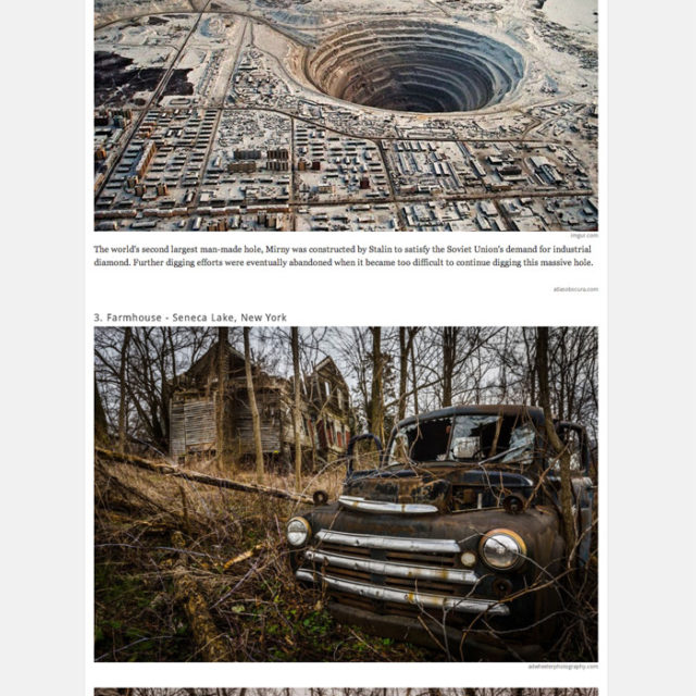
Check out a snippet from the single-page method from Distractify below. With the single page view, this list gets Distractify one impression for their Pro Flowers ad per visitor, whether they barely make it past the first picture or they go all the way to 38. It will take 1000 abandoned-place enthusiasts before they can cash out on their $3.10.
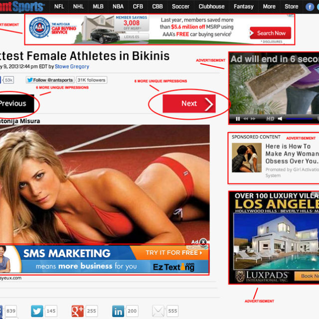
Now check out the multipage gallery below from Rant Sports (probably NSFW). With this method, the ad refreshes every time you hit “next,” which means that with six different ads on the page, Rant gets a new impression for each ad with every click—and with this kind of list, most viewers tend to rack up at least a couple of clicks, because somebody who clicked to see the “Hottest Female Athletes in Bikinis” is going to quickly become best friends with any “Next” button—as long as it brings them more pictures of the aforementioned bikini-clad athletes.
“Oh, cool! Grand Opening of the Rant store!”
Assuming that publishers make a CPM of $3.10, 100,000 visitors to Distractify’s list can gain them $310. If Rant Sports gets the same number of visitors, and has the same CPM, but the average user clicks through even half of the list (note that each athlete gets two slides), they can generate nearly 5,000,000 impressions, or $15,000 of ad revenue for that one list. That’s right, about 50 times the revenue.
See What a Click Can Do
So once again, the single-page list gets a shade over $300, at most, for 100,000 visitors, where as the multi-page gallery makes upwards of $15,000. Starting to rethink that single-page list of cat gifs you’re making? Us too.
So sure, it could be that we’re addicted to lists—they can be fun, semi-educational, or the quick distraction we were looking for. But more likely than not, list creators aren’t trying to make a more user-friendly experience: they’re just cashing in on mindless curiosity.


